Pyramid Awards: Built For Business

This year’s 10 winners of the coveted PPAI Pyramid Award In Technology have learned the secret to keeping clients coming back. Their innovative, state-of-the-art websites give clients the tools and information they need to save time, money and frustration, and inspire their imagination with endless ideas.
PPAI’s technology competition, one of five annual Pyramid Award programs available to member companies, recognizes the most effective websites based on judges’ assessments of the use of images, content relative to the intended audience, ease of use and creative delivery. A team of industry judges selected this year’s winners in the categories of e-commerce, mobile apps/websites and web content/functionality.
eCommerce Website
Gold Winner: Hexa | Custom
The Hexa Design Lab is an innovative microsite program that allows gift recipients (employees, event guests, award winners, etc.) to design their own jacket. Its purpose is to heighten the value of the gifting process by creating memorable experiences and giving receipients products they will love and be excited to receive. It also builds a culture of collaboration, creativity and individuality and results in unparalleled promotional value for the organization and distributor who championed it. The process begins with a questionnaire the distributor completes for the client with information on product styles, color palette and logo placements they wish to offer. Then the microsite is built and a custom link and redemption codes are shared with recipients. Then the fun begins as they bring their jacket to life with the choices offered along with gender, size and fit information. And finally, they check out with their redemption code, just like on any other e-commerce site.
Silver Winner: Showdown Displays
Showdown Displays’ Virtual Showroom provides an immersive and interactive product experience for distributor partners and their clients. Initially conceived as a method to address the transportation and presentation of physically large and cumbersome products, this initiative was accelerated by the challenges of remote presentations created by the pandemic. The elimination of in-person events and presentations evolved into an opportunity to reimagine product presentations and experiences. This comprehensive platform unites multiple facets of the Showdown Displays’ branding, innovation and educational efforts into a single reference point allowing users swift and easy access. All points within the environment were conceived as end-user friendly enabling reseller partners the freedom and ability to share this environment with their clients. Since its launch, the Showdown Displays Virtual Showroom has hosted more than 12,000 tours from 5,500 unique users.
Mobile Apps/Mobile Websites
Gold Winner: Gemline
Gemline’s redesigned mobile site makes browsing on tablets and mobile devices faster and easier, and the modern desktop site seamlessly transitions to the mobile site, resulting in an improved shopping experience. In addition, the streamlined mobile site features full product descriptions, detailed decoration information and alternate product images allowing distributors to see multiple angles of the item they are viewing. Content now also includes product videos with Designer Creative Clips and stop motion videos for a more stimulating viewer experience. All video content can be easily viewed on mobile devices from relevant product pages or from an easy-to-find video and webinar section in the footer.
Silver Winner: PromoPulse
PromoPulse was created to help promotional products professionals quickly and easily find ideas, inspiration and information from suppliers, service providers, associations and thought leaders. The promo industry generates over 750 pieces of new content daily and PromoPulse makes it easy to search, share and save that content. Distributors can personalize their content by choosing which publishers they want to follow and they can choose how they wish to consume the content: via app, daily email, Alexa or a searchable infinite scroll web feed. Plus, the Weekly Checkup email is delivered every Sunday with ideas from publishers recipients aren't following in the app but who are popular with other distributors.
Web Content/Functionality
Gold Winner: ePromos Promotional Products
ePromos’ redesigned website provides a modern and more efficient shopping experience for clients. Through improvements to the navigation, visual palate and site speed, the site now provides customers with clear visual direction to product categories, products for seasonal events, trends and popular searches, making it easier for those who know what they want and sparking ideas for those searching for ideas. The home page style and content were completely revamped. Lifestyle images show products in action, and the number of sections has been increased to allow more relevant products to be displayed. A new “Trusted By” section lets shoppers know the company works with recognizable brands. Since launching these updates, page load times have decreased by half and conversion rates have doubled.
Gold Winner: HPG
HPG’s new cloud-based, patent-pending, automated virtual tool HPG Catalog+ enables distributors to upload any number of logos in any format, select one to 10 HPG catalogs and, in minutes, receive a link to download customized, personalized copies in which every product on every page of every catalog is branded with the logos uploaded. The distributor is then able to use these catalogs, with pages of client-branded products, as sales tools when presenting to their clients.
Gold Winner: PromoCorner
PromoShow is a virtual trade show portal for suppliers, distributors and end users to communicate and share ideas via text chat and video conferencing. The portal is open 24/7 and can host both public and private events independently and simultaneously. In addition to exhibitor virtual booth space, PromoShow incorporates a separate lobby with space for education and training.
PromoShow is also designed to consolidate supplier content from various outside sources in a single space so attendees can learn more about a supplier without needing live interaction. Exhibitors may include searchable product data from DistributorCentral, social media posts from PromoPulse, digital flyers and catalogs from PromoCorner.com and videos from YouTube and Vimeo. This content is available to attendees at any time. In addition, attendees may schedule meetings with exhibitors, as well as check exhibitors’ schedules for access to live presenters. At a customer’s request, PromoShow can be “skinned” to provide a completely customized experience for private events.
Silver Winner: commonsku
The purpose of the commonsku site is to educate supplier and distributor prospects on the benefits and features of the commonsku platform and help current customers to learn more about the commonsku team, platform stats and updates. Because the site is the first impression that potential clients have of the company’s digital platform product, countless hours went into designing each element of the site, and analytics are used to improve it each quarter. Visitors will immediately see a snapshot of the platform product and be given a choice to either watch a video to learn more or watch a brief demo. Throughout the site, visitors will notice redesign upgrades, such as helpful infographics, flowcharts and gifs to address many of the common questions asked by prospects. Additional information, such as pricing, company information, education/training or the login portal, can be easily found in the top bar section of the site. A chatbot was also added (hosted by the company mascot, skubot) so visitors can ask questions and get answers in real time.
Silver Winner: Corporate Specialties
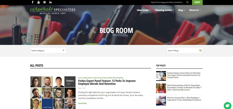
The Corporate Specialties blog features editorial-quality articles that illustrate the core of the company’s concierge service. Like a hotel concierge who knows the best restaurants, the Corporate Specialties team knows what promotional products are on-trend, on-brand and will get results, and these are featured in the blog. There’s also a three-part series on marketing strategy and a section that showcases client wins; for example, a $70,000 fundraising campaign built around a T-shirt Drew Barrymore wore on the cover of InStyle. The result is a well-rounded content forum that not only keeps customers informed but also allows them to save time and money by helping to narrow their product choices and make more educated purchasing decisions.
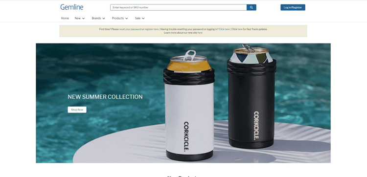
Silver Winner: Gemline
Gemline’s new website supports its commitment to digital transformation, providing customers with more self-service options while increasing the efficiency of site maintenance. With its tab format, the new design delivers a clean, modern look that is easily adaptable to mobile phone use. Improved navigation and upgrades throughout the site enhance the user’s experience with elements, such as highlighting top product categories under “What’s Trending,” a section the company can frequently update. New tabs below product images now allow users to see both decoration options and pricing on the same tab. In addition, a more robust page footer leads users to key areas within the site, and all product flyers are combined on one page with tabs to make it easier to find different types of flyers. Gemline solicited customer feedback to make these changes and upgrades and says it is now easier than ever for customers to find the information they are seeking.

